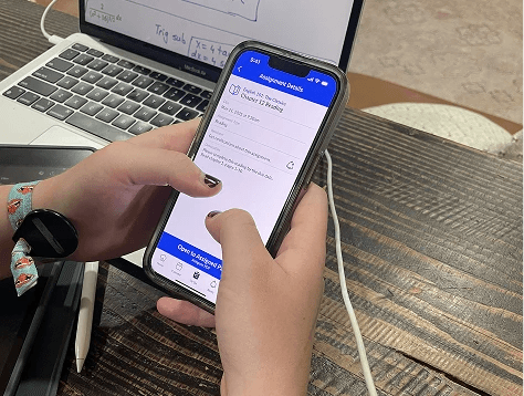
LMS REDESIGN
Canvas
BRIEF
Infinite flexibility sounds great until you're the one searching five different places for a syllabus. We learned to stop decorating the chaos and start restructuring it.
TEAM
Ethan Blatt
Josie Welin
FOCUS
DURATION
2.5 Months
YEAR
2025
Here's what nobody tells you about Canvas
The problem isn't the ugly interface. It's that Canvas made things too flexible.
Our professor gave us four apps to redesign: Amazon, Spotify, Hulu, Netflix. We said no. Not to be difficult—but because those apps have been redesigned dozens of times by professionals who'd do it better than us. We wanted a real challenge.
We pitched Canvas instead. Every college student uses it. Nobody loves it. And unlike polished consumer apps, Canvas serves two completely different users who never talk to each other: professors and students.
Our professor pushed back hard. "You need two competitors. Canvas dominates the LMS market." Fair point. We found Google Classroom and Microsoft Teams. Both had public versions we could access. Problem solved.
This choice mattered
Canvas isn't just a visual design problem. It's an information systems problem with a built-in conflict: professors want autonomy, students want consistency. That tension would end up teaching us more than any amount of pixel-pushing ever could.
We assumed wrong
Like most students, we thought Canvas just looked outdated—clunky, crowded, too much visual noise. Clean it up, simplify the interface, problem solved. Right?
Then we actually talked to people.
Our own professor mentioned in passing that she spent the first week of every semester teaching students her personal Canvas layout. Not because she thought we were incompetent, but because she knew every professor organized differently. One puts assignments in Modules. Another uses the Assignments tab. Another buries everything in Pages. Students relearn the treasure map for every single class.
That conversation changed everything
The real problem wasn't visual. It was architectural. Canvas gave professors infinite flexibility, which created chaos for everyone—including the professors who felt overwhelmed by all that freedom.
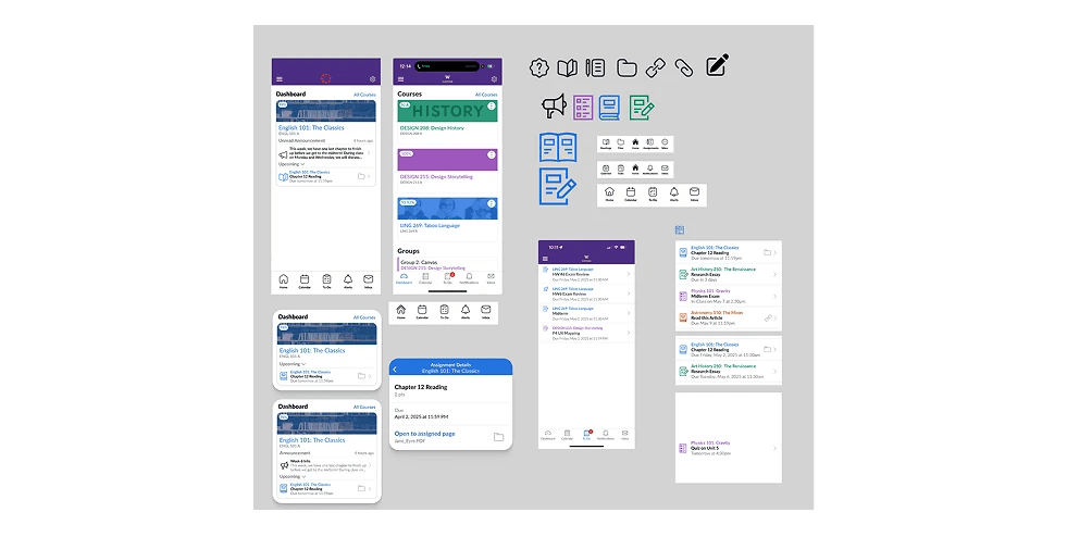
We designed a sleek, minimal interface. Modern typography. Clean hierarchy. Better visuals. Then we tested it. Students liked how it looked but still couldn't find anything. Professors appreciated the polish but said it didn't solve their actual problem.
The feedback stung. But it forced us to look at the real issue: information architecture, not aesthetics.
We standardized the structure
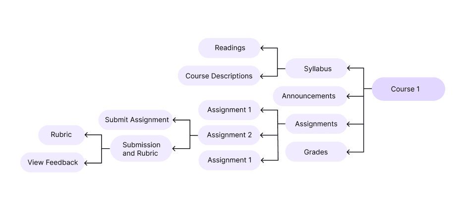
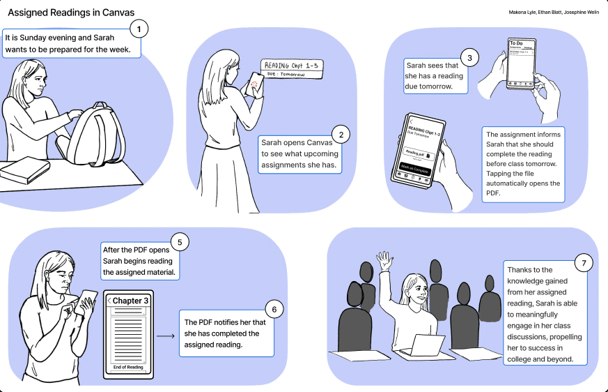
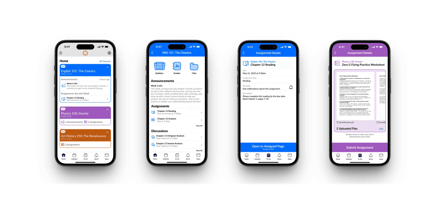
Created fixed navigation categories that professors couldn't reorganize. They could still customize what went inside each section, but the "rooms" stayed put. Added a dedicated Readings section after students told us they constantly lost track of assigned texts. Built consistency and predictability into the foundation instead of just making things prettier.
My role:
I led research strategy and ran most of the interviews. Initially, we weren't even planning to talk to professors—just students complaining about the interface. But when our professor casually mentioned how overwhelming Canvas setup was her first year teaching, I connected the dots. Both groups felt the same pain from opposite sides: professors drowning in flexibility, students drowning in inconsistency.
After our first concept bombed in testing, I mapped the navigation categories that would create a standard structure professors couldn't break. I also ran the usability test that killed our original design—watched students struggle to find information I thought was obvious. Frustrating in the moment. Essential for the project.
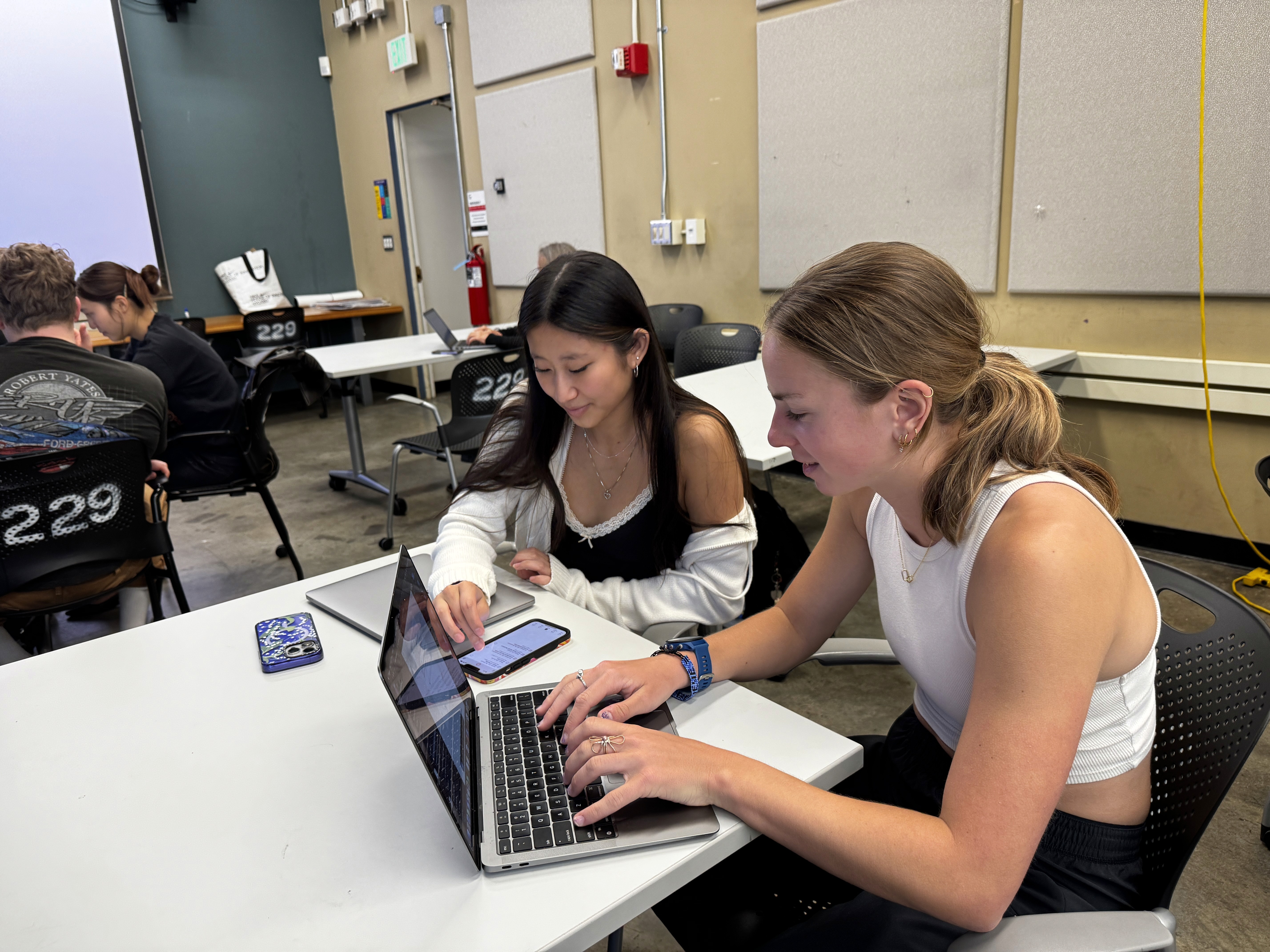
For our second concept, I helped build low-fidelity prototypes and brought our professor into testing early. Learned that ugly sketches are fine when you're testing structure. Actually saved us time.
What I wish I'd done differently
Involved more professors earlier. Not just one or two interviews—multiple perspectives throughout the design process. We would've discovered the architecture problem weeks sooner. I also held onto our first concept too long. Spent hours perfecting those prototypes, got attached, convinced myself we were too far in to pivot. I'm better now at killing my darlings when they're not working.
Here's what was actually exceptional about this project
Most student work focuses on one user. We had to solve for two groups with opposing needs. The impressive part wasn't doing user testing with both—it was recognizing that Canvas' architecture was built on a flawed assumption: that professors wanted infinite autonomy and students would just deal with the consequences.
Turns out, professors didn't want infinite flexibility either. They wanted a reasonable starting point with some customization options, not a blank canvas (pun intended) that required them to architect everything from scratch.
